How To Outsmart Every Bitcoin Trader
On-chain analysis (or blockchain analysis) is an emerging field that examines the fundamental factors of cryptocurrencies to improve investment and trading decisions.


How Can On-Chain Analysis Make You A Better CryptoCurrency Trader?
What is On-Chain Analysis?
In the simplest terms, On-Chain analysis is pure edge.
To understand what that means, we first have to understand how the Bitcoin and cryptocurrency markets are different vs. how the legacy markets work.
Data Is The New Oil — On-Chain Analysis Is The New Refinery
Traditional markets are unfortunately almost completely devoid of fundamentals (perhaps with exception of the bond market) with most responding strongly to central bank policy announcements, rather than actual performance. The challenge for retail investors is that we have almost no chance beating the institutions in front running and catching undervalued gems before it is priced in.
Retail is always second in line (WallStreetBets & Robinhood made that very clear)
Cryptocurrency markets flip this on its head. Not only are we in this market before the institutions, but the markets are open all day with no favoritism (relatively speaking). Sure there are still whales and price manipulation, that is never going away. What we do have, is a leg up and a relatively fair playing field.
On-Chain Analysis is our strongest toolkit to beat the crowd—the retail and institutional crowd.
It is most powerful when applied alongside the Monthly, Weekly, and Daily timeframes. In general, it is best used to set your Macro bias which you can then carry with you into the lower timeframe trenches of the price charts. This piece will cover some of the categories of On-chain indicators, how to apply them and where you can source charts and data to use them.
I will focus primarily on Bitcoin as it has the most robust toolkit available. Future articles can focus on Decred and Ethereum which are the only other two with enough of a heartbeat to make on-chain analysis worthwhile. This will be the first part as there are so many on-chain indicators, it takes a while to absorb them all!
These indicators generally look at current price performance and compare it to historical extremes from previous cycles. Given the halving cycle is 4yrs like clockwork, we can make a reasonable assumption that this asset will go through the same cycle of capitulate > disbelief > bull > euphoria > disgust > repeat in 4yr increments which shows up in almost all of these metrics.
We recently launched a new On-Chain Analysis Dashboard, which you can get free access to by going here: https://checkonchain.com/
On-Chain Valuation Models
The first category is what I call fair value models which can be used to set a basis for the center of gravity of price.
Based on probability, these models are basically where we can expect the price to be attracted to over macro timeframes. When price deviates too far above or below, we can expect it to snap back towards the center of gravity.
What is powerful is to look for a confluence where multiple models line up at the same approximate price range.
Stock-to-Flow Model
Plan B’s model has shown to be a very high signal to date and is one of the best fair value models.
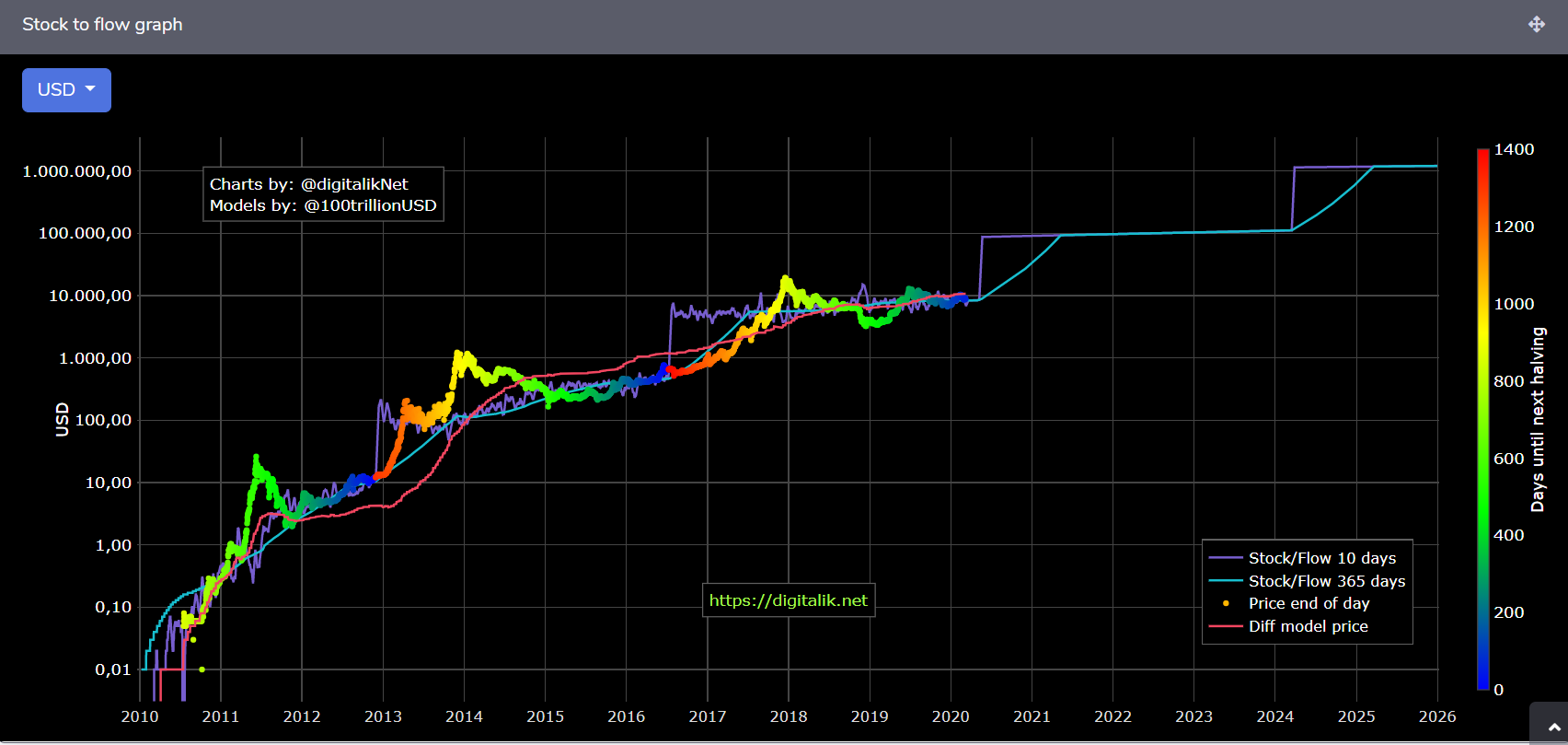
This model indicates that a price of around $8200 is expected through to the halving and we usually see the price converge to the S2F estimate on that date. Beyond that, who knows but the supply shock will occur whether the government, coronavirus or the greens activists petitioning against mining like it or not. The 365-day average is also shown to smooth out the estimate post halving.
The S2F Multiple is basically a ratio between the estimated price and the actual price. This shows the potential energy to ‘snap back’ to the model when price deviates significantly in either direction. In the chart below, we can see that at the halving events (blue) price converges to a multiple value of 1.0 before expanding. Consider this akin to the chop index reaching full spring energy before being released post halving.
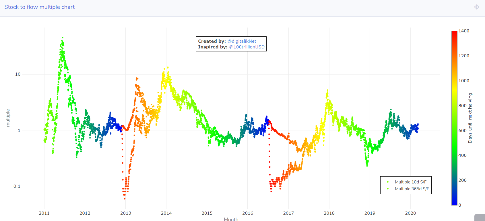
https://digitalik.net/btc/sf_multiple
200D Moving Average & Mayer Multiple
Similar to the S2F model, the 200D MA is one of Bitcoin’s magic lines. It is a centerline for the macro bull-bear shifts, acting as support and resistance and often a point of oscillation as the spring gets wound tight.
Historically, a Mayer Multiple (ratio of price to 200DMA) above 2.4 is a strong signal to take some value off the table and a value of 0.6 to 0.8 is a strong add point. This can be used as a ‘buy the dip indicator as well during bull markets, basically indicating that price has returned to touch or dip below the 200DMA and should bounce.
The reverse is true in bear markets when price is usually below the 200D and rallies are best sold into when they touch the 200DMA (Mayer multiple of 1.0).
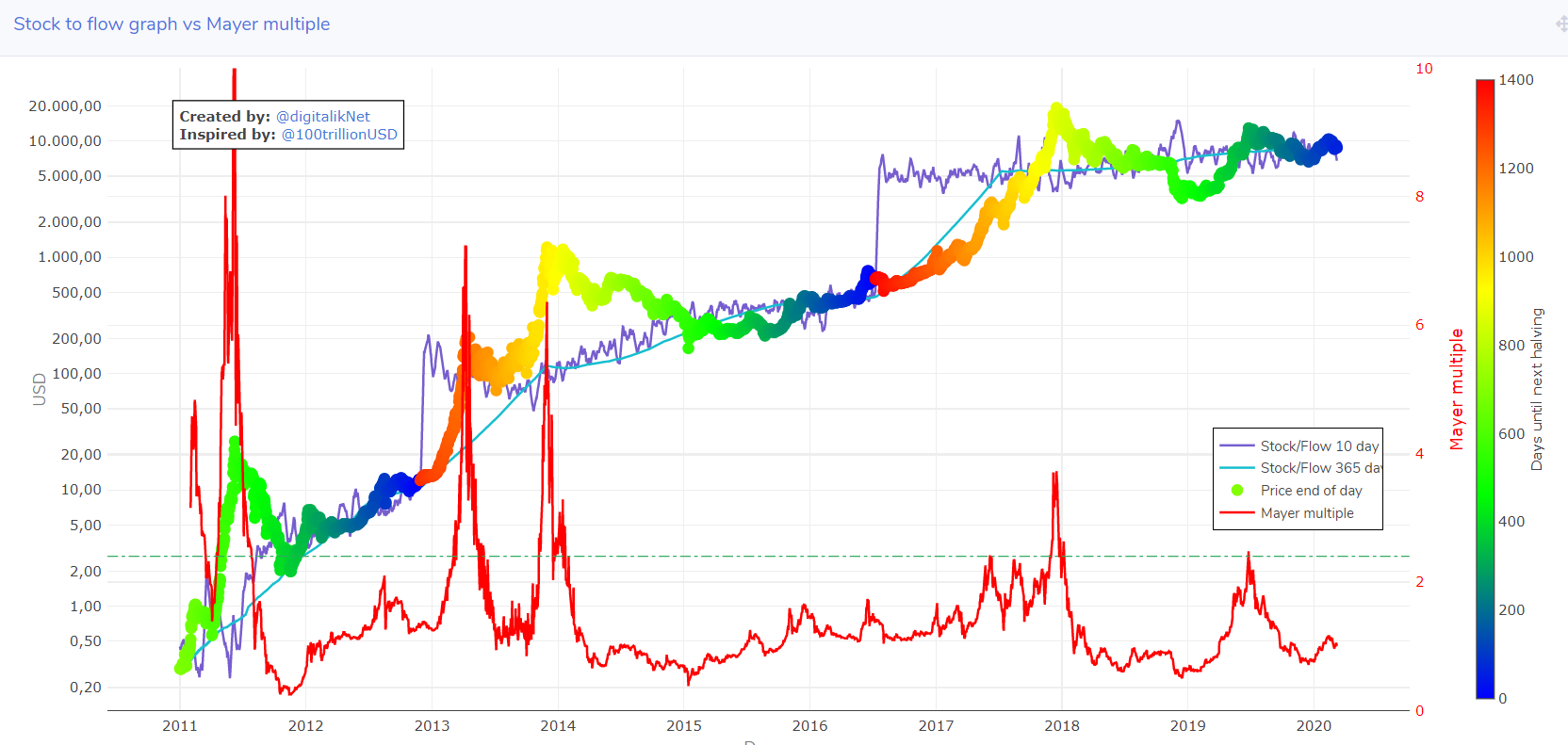
https://digitalik.net/btc/mayer_multiple
Digitalik also has a Mayer Multiple bands which act similar to Bollinger bands and show periods of over and undervaluation. Fairly intuitive, buy in the green zone, sell in the red zone.
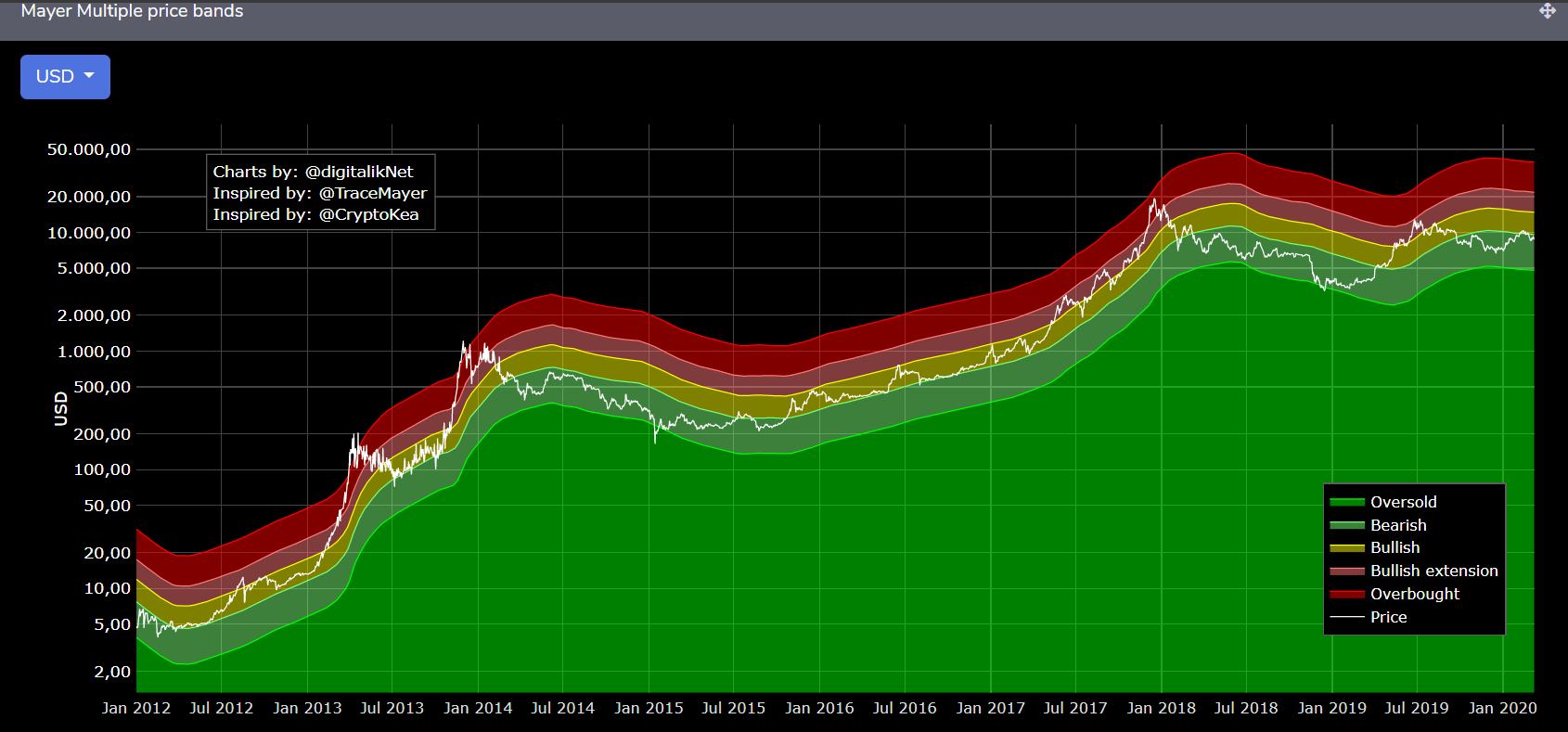
https://digitalik.net/btc/mayer_bands
Cycle Low
Another set of tools that will be coming into good use shortly is measuring how far into a trend we are.
The most intuitive metric is the cycle low, which asks, “What is the current price appreciation since the capitulation point?”
Now, the selection of the capitulation price is subjective and is only clear in the rearview mirror but we can quickly see that the price trend is similar across the last two bulls.
Keep note that the angle of ascent is shallower on Era 2 (2015 to 2017) than the early years of 2009 to 2012. This trend shows up in many indicators as the volatility and slowness of the asset increases with bigger liquidity, more participants, and higher prices.
The chart below shows that, again, leading into the halving has been very similar for all eras and to be honest, gives credence to both the S2F and 200DMA fair value models. After that, it gets a bit more wild and unpredictable.
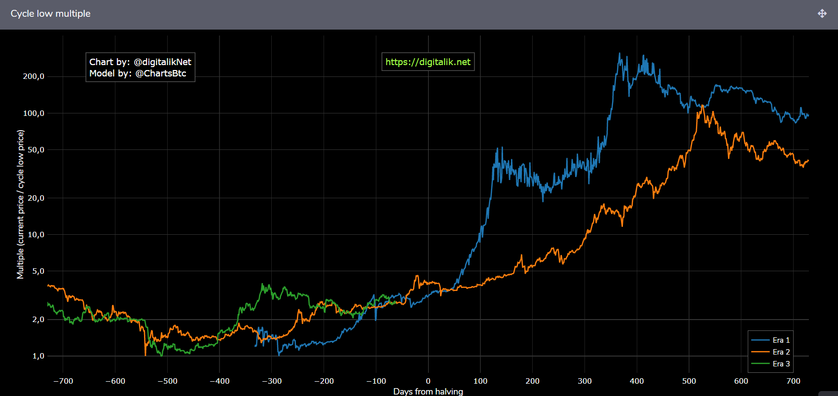
https://digitalik.net/btc/cycle_low_multiple
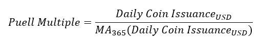
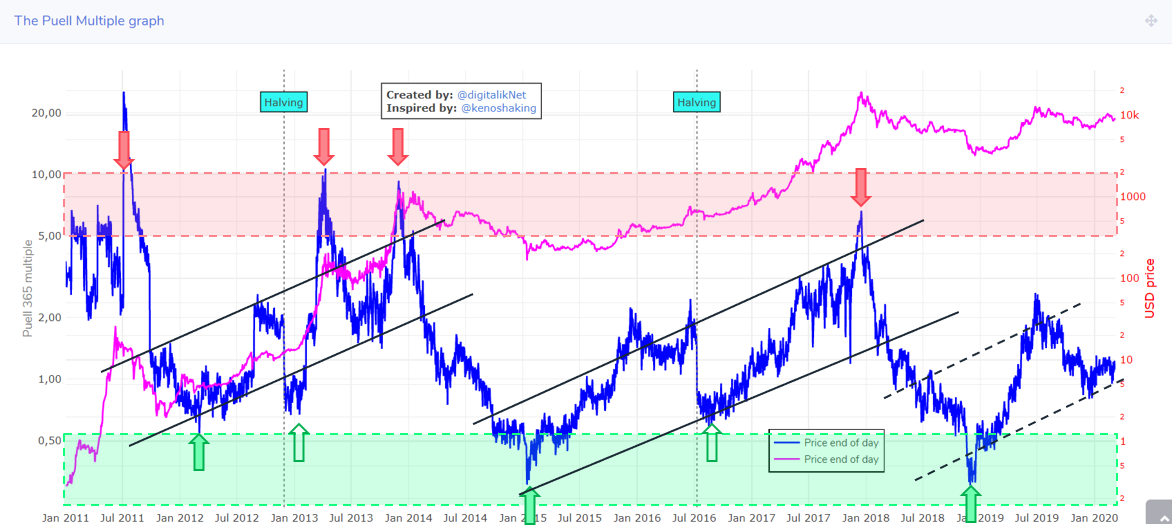
Puell Multiple
The Puell Multiple is targeted at the supply side miners who acquire BTC for power and then need to sell to recuperate their operating expenses. It is a simple formulation as the ratio of USD value issued to the 365D moving average of this value. When miners are being issued with much more value than their yearly average, the Puell Multiple will be high and at values greater than 5, has historically been market tops.
Conversely, when miners are being issued with substantially less than their yearly average, it indicates miner stress and potential undervaluation. Values below 0.6 have historically been strong buy points and often occur during capitulation and after immediately the halving.
One can also see trendlines emerge in the Puell Multiple which once broken, can indicate a trend reversal:
The original paper for the Puell Multiple and the chart is here:
https://medium.com/unconfiscatable/the-puell-multiple-bed755cfe358
https://digitalik.net/btc/puell_multiple
Closing Thoughts
On-Chain analysis is an expanding tool-set, and through understanding its suite of models and tools, you’ll be able to more effectively operate in any market condition.
With these indicators mastered, you can buy the best dips and sell the strongest tops.
To that end, I’d like to highlight our brand-new service devoted solely to On-Chain metrics, education, and discussion.
We’re looking to write the book on On-Chain Analysis, and if you’d like to join us before they become more mainstream, you can get in early by visiting:

If you’d like to learn more about On-Chain Analysis, I highly suggest you visit our brand-new service devoted exclusively to it! Get in now before we have to lock new members out in order to keep the discussion focused and the community passionate!
See you there!
Cheers,
Solo