Bitcoin On-Chain Analysis: The Holy Grail Of Market Edge
Bitcoin On-Chain Analysis: The Holy Grail Of Market Edge
On-Chain metrics show us the beginning of a whole new field of study: true quantitative + qualitative analysis for digitally native assets. Let's see how they work.


In this article, we’ll cover the exciting new field of blockchain On-Chain Analysis, and why I believe it is an excellent tool for finding an edge in the cryptocurrency market.
Let’s dive in.
Uncensorable Transparency
Bitcoin is many things.
In my opinion, the most fascinating interpretation is that Bitcoin is the first digital organism.
I’m reminded of a great quote from Ralph Merkle (creator of the Merkle tree data structure) about Bitcoin.
“Bitcoin is the first example of a new form of life. It lives and breathes on the internet. It lives because it can pay people to keep it alive. It lives because it performs a useful service that people will pay it to perform. It lives because anyone, anywhere, can run a copy of its code.
It lives because all the running copies are constantly talking to each other. It lives because if any one copy is corrupted it is discarded, quickly and without any fuss or muss. It lives because it is radically transparent: anyone can see its code and see exactly what it does.”
– Ralph Merkle
You see, Bitcoin’s value comes from many narratives around the paradigms it has shifted or outright disrupted — unconfiscatable peer-to-peer money, deflationary digitally-native assets, the blockchain’s unique solution to decentralized governance, etc.
However, what should interest us most today is a completely new paradigm Bitcoin introduced – Uncensorable Transparency.
Every single action that occurs on-chain is recorded by every single node on the network and encrypted by the most secure network on earth. The degree of data redundancy in the Bitcoin network is unparalleled and the finality of events is arguably the first guaranteed source of truth we have ever had.
What Is On-Chain Analysis?
As the Bitcoin network is so transparent, we can observe all transactions which occur on the network and begin to analyze the fluctuations and temporal trends which arise over time.
This gives rise to On-Chain Analysis (OCA) — the technical study of patterns to identify trends, correlations, and signals based on fundamental behavior of the network.
Perhaps an easier way to understand what edge OCA provides is to think of it as a unique blend of Fundamental Analysis (FA), which studies the fundamentals of a particular asset (e.g., EBITDA, EPS, P/E Ratio, etc.), and Technical Analysis (TA), which analyzes statistical trends gathered from trading activity to determine effective decisions (e.g., price movement and volume).
In a sense, FA tells you what to buy or sell, and TA tells you when to buy or sell. So, what does OCA tell us, then?
Remember that Bitcoin has introduced us to new paradigms — what worked for stock analysis won’t exactly work here, but that’s less of a negative than it seems. In fact, what OCA gives us is the first glimpse at a blockchain-native quantitative analysis model, as Bitcoin is the first asset where FA has charts that can be analyzed in a similar manner to Technical Analysis TA.
What this means is that, once we know our OCA models are working, we can combine the benefits of both FA and TA in a truly revolutionary way!
I’d go so far as to say this is the beginning of a whole new field of study: data analysis for digitally native assets.
If data is the new oil, then OCA is the new way we forecast price, supply, and demand of the digital “Brent Crude” — Bitcoin.
So, let’s talk about the data.
Digging Into The Data
Now, we need to define the difference between Intrinsic data and extrinsic data.
Intrinsic Data — Information contained within the Bitcoin UTXO set. It includes data such as transaction timestamp in block time, transacted volume in BTC, addresses involved in the transaction, fees paid, Bitcoin hashrate, hashrate difficulty, and coin supply.
Extrinsic Data — Information that is not native to the UTXO set which we mere mortals assign to Bitcoin. This includes calendar date:time since block time is actually variable with hashrate and not exactly 10mins, Coin price, and network valuation. Bitcoin has no idea what day of the week it is nor what the last traded price was, it just knows the block height and who owns how much at that time. It is important to note that all trading volume that occurs on exchanges is NOT seen by Bitcoin as this all occurs internal on the exchange, not on-chain.
OCA combines these two datasets and connects them via human date:time and Bitcoin block time (as best as possible). This creates a bridge between extrinsic data including price to the intrinsic UTXO data set. Now we can start looking for patterns and correlations such as whether price is correlated to hashrate, transaction volume, or even the fees paid to miners.
What we are looking for here are patterns that repeat over time or indicate macro shifts in network behavior. The most powerful observations are those which identify shifts in intrinsic data trend (akin to a change in actual network utilization) to the network valuation (price and market cap).
An example of this is when lots of people are sending transactions and making use of the network, the demand should increase and thus coin price should increase in theory. Conversely, if the market has a high valuation but low on-chain transaction, the network is likely overvalued and is likely to correct.
This has so far shown to be true and is exactly what the NVT Ratio captures, as we’ll now discuss by covering the actual metrics we use with OCA.
Overview of on-chain metrics
I guarantee that 99.99% of the market ONLY looks at the price and market cap of Bitcoin.
If you start to incorporate on-chain analysis into your strategy you will find edge when looking for macro shifts in market behavior. You don’t need to watch on-chain data as frequently because it is most useful when looking for market tops and bottoms.
What I will say is that this is one of the best tools out there to help you buy the bottom and sell the top in the next cycle.
Here are the principal components of OCA, and why you need to pay attention to each.
Market Cap – This is just coin price multiplied by circulating coins. It is a concept borrowed from equities and is affected by speculation, emotion, and exchange-traded volume. It is highly volatile and is the ONLY metric most people look at…this is a good metric to compare the speculative value (market cap) to actual utility value (Realized Cap, transaction volume, etc.)
Realized Cap – This is a measure of the average cost basis of the entire market and the Wealth stored in Bitcoin. It takes every coin and multiplies it by the price when it last moved. Therefore it estimates the price that all ‘HODLers’ and whales paid for their coins. If the Market Cap is above the Realized Cap, the market is on average in profit. Conversely, when Market Cap falls below Realized Cap, it is a sign of capitulation and the market being underwater and has so far been the buying opportunity of the decade.

Figure 1 - Market Cap (green) vs Realized Cap (yellow) and coin supply (blue). Note how Realized Cap is a smoother stair-stepping pattern and when market cap falls below it signals a buying opportunity
NVT Ratio – This is the Market Cap divided by Transaction volume on-chain. It represents how much the network is being used (transactions) compared to the network value. If transactions are high, the network has high demand and utility and the NVT is low (< 10 in a bull market). When the NVT increases to more than 18 to 30, it means price is getting too high compared to network utility and may be somewhat overvalued. NVT is the equivalent to the Price-to-Earnings ratio (PE) of equities as the value throughput of Bitcoin.
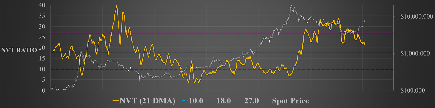
Figure 2 - The NVT Ratio (yellow) acts like an oscillator where values between 5 and 15 are common in a Bull market and values higher than around 18 are typical of bear markets (high NVT means low transaction volume and high network value = overvalued).
HODL Waves — These show the age of all coins on the Bitcoin network, that is the time since they were last moved. Older coins are usually purchased at a cheaper price by strong hand HODLers which means when they are on the move in large volumes, it may be indicating profits are being realized. This is represented by the blue colors where the large dark blue area represents coins older than 5yrs and contains the strongest hands, presumably lost coins, and even Satoshi’s coins. The important thing to watch for is when the orange and yellow zones grow larger in a short period of time. This may indicate large scale profit-taking OR capitulation and could signal market tops or bottoms. You can find the HODL waves at Unchained Capital here.

Where Can I Find On-Chain Charts?
At the moment, there are a plethora of research papers out there on these topics for those of you who are interested in reading up further. The majority of these are on Medium so I would suggest following these analysts on there as well as Twitter, Substack, their blogs, and archives.
Just do one paper at a time as they’re information-dense but very well written:
Chris Burniskie – Placeholder VC
Will Woo - Woobull Charts
Murad Mahmadov – Adaptive Capital
David Puell – Adaptive Capital
Tuur Demeester – Adamant Capital
Nic Carter – Twitter, Castle Island Ventures and Coinmetrics
Travis Kling at Ikigai – Kana and Katana depot of information
Plan B – Modelling with Scarcity
If you are keen to play around with charts and look at on-chain data, there are two main tools available for us.
The first is Woobull charts http://charts.woobull.com/. These are maintained by Willy Woo and are preselected sets of data which can be very useful in getting a broad picture of what is going on. Willy is often posting about what he sees on Twitter and is worth keeping an eye on. I believe that Willy trades solely based on on-chain data and has a reduced focus on price candles compared to the average punter.
The second location is Coinmetrics who have a charting package that is more customizable and can be used for many different assets https://coinmetrics.io/charts/#assets=btc.
You can create your own combination charts, moving averages, and ratios using the formulas section (an example is here for the Realised Cap and MVRV ratio).
The best bit about CoinMetrics is that their data is considered best in class (Woobull uses it also) and can actually be downloaded in CSV format for any coins they support so you can create your own charts in Excel or another plotting interface as you wish.
I’d also like to highlight our brand-new service devoted solely to On-Chain metrics, education, and discussion.
We’re looking to write the book on On-Chain Analysis, and if you’d like to join us before they become more mainstream, you can get in early by visiting:

Final Thoughts
I believe that on-chain analysis will be the tool that sets investors apart in the next cycle.
It has shown to be incredibly accurate for picking market tops and market bottoms and helps provide buy low and sell high signals for the long HODL.
One thing to note is that on-chain analysis CAN be done for almost all coins . . . but, right now, only Bitcoin actually has an organic utilization rate such that meaningful information can be obtained.
The reality is most other coins just are not being used for any purpose other than speculation and Bitcoin has the advantage of liquidity, reputation, fiat on-off ramps, and coin pairings. This may change in the future for coins that see large-scale adoption but for now, this is a Bitcoin-only tool.
This is an important observation as it shines the spotlight on Bitcoin remaining as the primary asset in this industry with the most organic growth and real utility by investors, HODLers, speculators, and people in need of digital money.
If you’d like to learn more about On-Chain Analysis, I highly suggest you visit our brand-new service devoted exclusively to it! Get in now before we have to lock new members out in order to keep the discussion focused and the community passionate!
See you there!
Cheers,
Solo